There are 3 types of charts commonly used in technical analysis:
- Line Chart
- Bar Chart
- Candle Stick Chart (Most Popular)
Line Chart
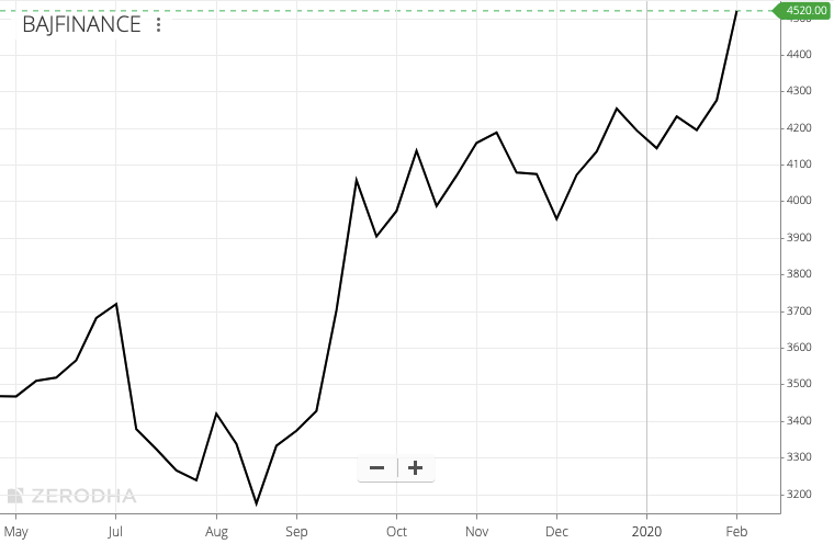
This is the simplest form of chart that is used in technical analysis. The chart is constructed by joining the closing price. It does not take into consideration other data points like opening price, highest price or lowest price.
Experienced technical analysts and others who consider the closing price to be the most important price, use the simple ‘Line Chart’ to get a clear picture.
Line Chart uses only the closing price on different time frames. On 1-minute line chart, the closing price after the end of every minute is taking. On 60-minute or 1-hour chart, the price at the end of every hour is used. In the same way, the closing price at the end of the day is taken on daily chart. On weekly chart, the closing price on Friday is included.
Positives of Line Chart:
- Simple and easy to understand. Not confusing even for beginners of stock market trading.
- Works well when comparing the movement of many stocks on the same chart.
Negatives of Line Chart:
- Very limited information, only contains closing price. Doesn’t include Opening / High / Low price.
Bar Chart
Bar chart contains more information as compared to Line chart. It has the opening price, the highest price, the lowest price and the closing price.
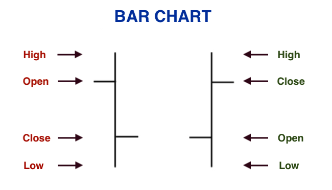
The vertical line has the highest price on top and the lowest price at the bottom. The horizontal dash on the left side is the opening price. The horizontal dash on the right side is the closing price.
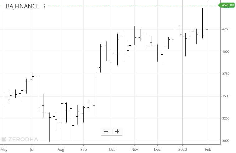
Below, we have the ‘Weekly bar chart’ of Bajaj Finance. Each bar has one week worth of data. The bar formation begins on Monday with a horizontal dash on the left side. The bar ends on Friday with horizontal dash on the right side. The highest price of the week and the lowest price of the week are connected by a vertical line.
Candle Stick Chart
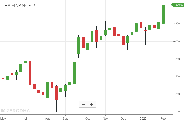
CandleStick Chart is the most popular charting technique in the world. Each candle contains four important price points – Open, High, Low, Close (also known as OHLC).
The body of the candle is coloured in green or red.
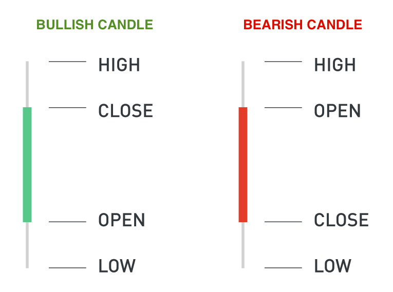
A Green candle means the price has moved up. A Red candle means the price has gone down.
On the green candle, the closing point is above the opening point. On the red candle, the closing price is below the opening price.
The highest price is at the top of the candle stick and the lowest price is at the bottom of the stick.
The green and red candle are also known as Bullish and Bearish Candles.
Below, we have the ‘Weekly candlestick chart’ of Bajaj Finance. In the weekly chart, each candle has one week worth of data. The candle formation begins on Monday and ends with the closing on Friday. A red candle of Bajaj Finance means, that week the stock started at a higher price on Monday and ended at a lower price on Friday. The stick at the top of each candle is the highest price, the stick at the bottom is the lowest price of the week.
How to change chart type in Zerodha?
Zerodha is the most popular broker in India – used by more than 1 million users. Hence, the tutorial on how to change the type of chart in Zerodha.
By default, Zerodha will display ‘Candlestick chart’. If you intend to use candlestick charts, you do not need to change any settings. To use ‘Bar’ or ‘Line’ chart, click on ‘View Chart’ which will display the chart in your ‘Kite’ application.
For desktop or laptop users, click ‘Display’ which is just above the chart. Then select ‘Bar’ or ‘Line’ in Chart Type.
For those using ‘Kite’ application on Android or iOS, click on the ‘Display’ icon and select the chart type. Mobile app users can also watch the video below.

Leave a Comment